Marker Icons
This guide focuses on icon-based markers: a plain image URL, an icon built from a DOM node, and the small configuration details that make them feel different on the map.
Visual variants
These examples use the same marker APIs with different icon strategies:
| Variant | Use when |
|---|---|
icon: string | You already have an SVG or PNG URL |
icon: HTMLElement | You want DOM styling but still want the SDK marker layout |
anchor + iconProperties | You need precise placement and size control |
Local assets for stable examples
const markerIcons = {
  food: "/assets/icons/marker-food.svg",
  parking: "/assets/icons/marker-parking.svg",
  info: "/assets/icons/marker-info.svg",
}
URL icon marker
import { TextPosition, type MarkerConfig } from "@mapvx/web-js"
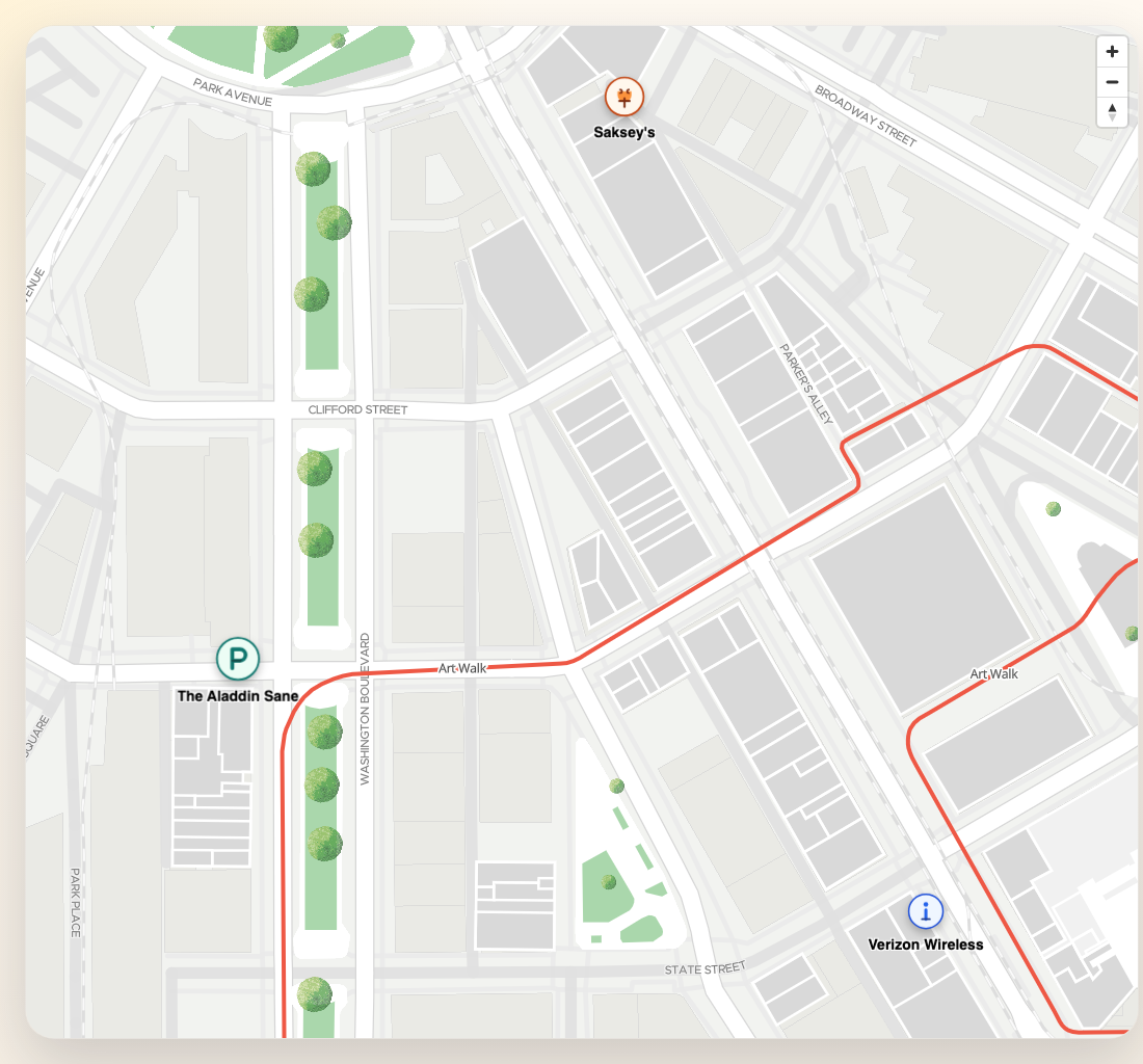
const foodMarker: MarkerConfig = {
id: "marker-food",
coordinate: { lat: 4.666918, lng: -74.053065 },
text: "Food hall",
textPosition: TextPosition.bottom,
icon: markerIcons.food,
iconProperties: {
width: 36,
height: 36,
},
anchor: "bottom",
}
map.addMarker(foodMarker)HTMLElement icon marker
You can also pass a DOM node as icon. The SDK still builds the final marker container, but the
icon itself is now fully custom.
const iconNode = document.createElement("div")
iconNode.className = "status-dot"
iconNode.innerHTML = `
  <span class="status-dot__core"></span>
  <span class="status-dot__ring"></span>
`

const liveMarker: MarkerConfig = {
  id: "marker-live",
  coordinate: { lat: 4.6671, lng: -74.0529 },
  text: "Live user",
  icon: iconNode,
  textPosition: TextPosition.right,
  anchor: "center",
}

map.addMarker(liveMarker)
.status-dot {
position: relative;
width: 18px;
height: 18px;
}
.status-dot__core {
position: absolute;
inset: 3px;
border-radius: 999px;
background: #0f766e;
}
.status-dot__ring {
position: absolute;
inset: 0;
border-radius: 999px;
border: 2px solid rgba(15, 118, 110, 0.35);
}Comparing anchors and sizes
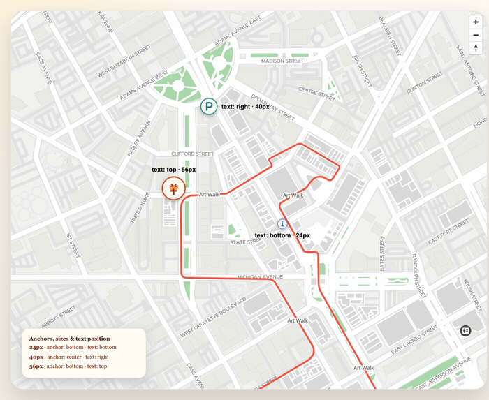
const markers: MarkerConfig[] = [
  {
    id: "marker-parking",
    coordinate: { lat: 4.6666, lng: -74.0531 },
    icon: markerIcons.parking,
    iconProperties: { width: 28, height: 28 },
    anchor: "center",
  },
  {
    id: "marker-info",
    coordinate: { lat: 4.66675, lng: -74.0527 },
    icon: markerIcons.info,
    iconProperties: { width: 44, height: 44 },
    anchor: "bottom",
  },
]

markers.forEach((marker) => map.addMarker(marker))
Recommended pairing with real places
When the marker represents a real place, prefer deriving the marker data from
MVXPlace:
const place = await sdk.getPlaceDetail("<PLACE_ID>")

map.addMarker({
  id: `place-${place.mapvxId}`,
  coordinate: place.position,
  text: place.title,
  textPosition: TextPosition.bottom,
  icon: markerIcons.info,
  floorId: place.inFloors?.[0],
})
Choosing between icon: string and icon: HTMLElement
Use a URL string when you have a static SVG or PNG and want the lightest possible marker. The SDK caches the image and renders it directly on the map canvas.
Use an HTMLElement when the icon needs CSS-based styling, animations, or internal structure (like a pulsing status dot). The SDK wraps it in a MapLibre marker, which is slightly heavier but gives full DOM control.
If you want the entire marker to be a custom card or badge instead of a standard icon/text layout, continue with HTML Markers.